Timelines were my first experience with a tool that kind of sucks for displaying content because it boils complex ideas down to names and dates (the bane of every K-12 student). The second tool that had a similar issue was PowerPoint, where I heard over and over again that it’s boring, but I have yet to find or be given a better alternative.
The theme here is to do the best with what you have. Timelines are not necessarily riveting or engaging ways to interpret or understand history. They usually focus on one event almost in a vacuum and reinforce that pervasive notion among non-historians that history is just names and dates. I do think timelines can be helpful. I have seen them used in museums, and the important distinction here is museums that use timelines effectively place timelines within a wider context so the viewer can use the timeline as a reference point to larger events.
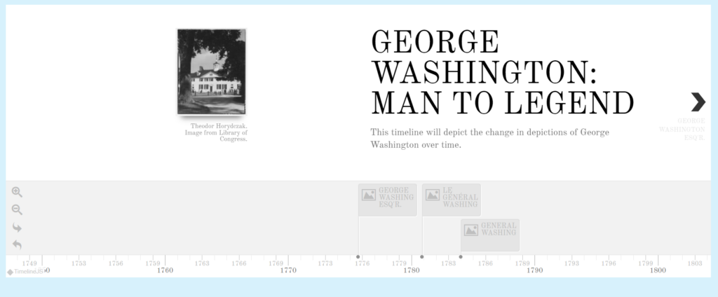
I was thinking about timelines while using Knightlab’s TimelineJS. While trying to decide which topic to use for a timeline, I wanted to do something a little different from the old “using a timeline to put major events in order,” and settled on finding what images I could from the Library of Congress to show a change in the depiction of George Washington over the years. This requires a basic knowledge of wider US historical events, such as before and after the American Revolution, Manifest Destiny and Westward Expansion, and the Civil War to understand attitudes towards those “Founding Fathers.”
Trying to figure out how the timeline would be formatted once it was completed was difficult because below is what the construction of a timeline looks like on TimelineJS.
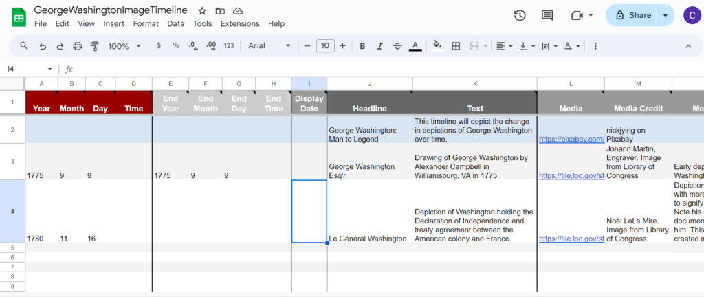
This was intimidating at first, since I didn’t understand the format translation from the spreadsheet to the final product. This is a template the site provides when you start the process of creating a timeline, which is very helpful. I clicked on the boxes I needed, cleared out their instructional text, and entered my own. The only downside to this is you can’t tell what the timeline will look like until you’re ready to publish. TimelineJS plugs it in, and you can alter the text font and the size of the embedded material, but I like seeing what I’m working on while I’m working on it.
This was also a shock after having used Knightlab’s StorymapJS (which I reviewed here). However, Knightlab is consistent in keeping their tools easy to use with plenty of tutorials and examples on how you might use their tools. They offer a brief two and a half minute video on how to use the template they provide and they have an FAQ at the bottom of their page. Altering the spreadsheet post publication is also a breeze, since all you have to do is click on the cell with the information you need to fix, and fix it. No need to republish, it updates itself. There are also optional settings in the spreadsheet that can be changed post publication, but for those changes you would need to update the embed code. The ease of changing information or media works in TimelineJS’s favor, since you can’t see what you’re working on until it’s published.
I had to change my title image after I already published my timeline, linked here.
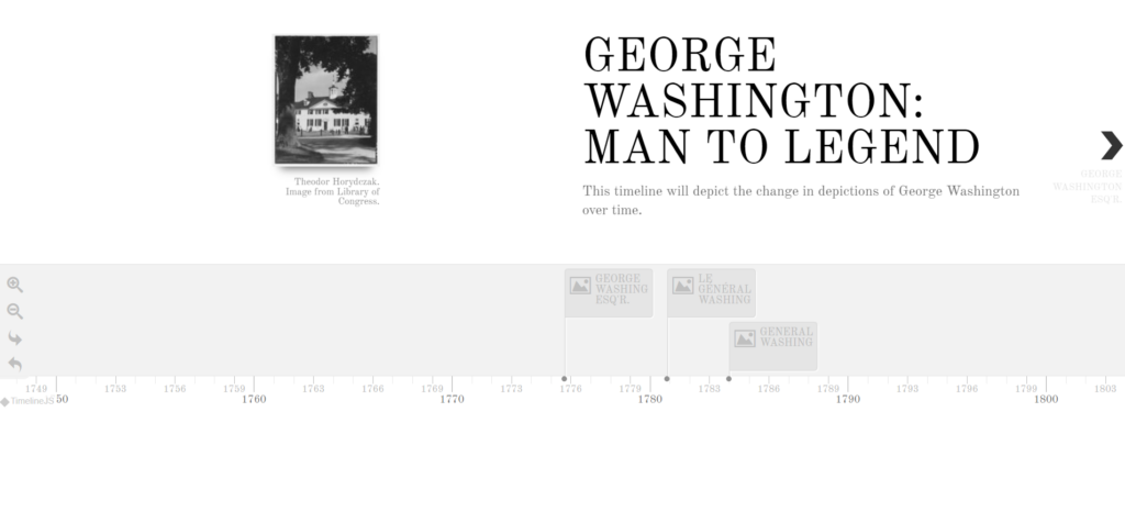
Here is a screenshot of the finished timeline. TimelineJS has some difficulty embedding into WordPress, which is unfortunate. However, the pros outweigh the cons for this tool. It takes minimal adjusting to create a timeline in a spreadsheet, you can see the timeline with the media and text, it’s usable in a browser and it’s free. You can also have start and end dates to show the overlap of events over time. I can see this being used on an interactive screen in a museum, again for that reference point, or in a classroom setting.